 Portland’s carbon footprint, mapped by neighborhood. (The deeper the green, the lower the footprint.) (Source: New York Times)
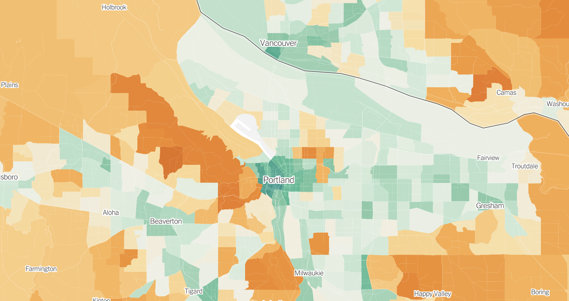
“Households in denser neighborhoods close to city centers tend to be responsible for fewer planet-warming greenhouse gases.”
Want to know how your neighborhood’s average carbon emissions stack up to other places around the country? Look no further than a new map from the New York Times created with data from the University of California, Berkeley, which puts the important relationship between city planning and the climate crisis on visual display. For people who know how important sustainable city planning is for carbon emissions reductions, these findings won’t be surprising, but it’s striking to see it laid out so clearly.
The data breaks down every U.S. census tract according to five categories: transportation, housing, food, goods and services. Although the latter three categories are important as well, the first two categories are the most crucial for city planners to look at, especially since they often make up the biggest contribution to a household’s carbon footprint.
Taking a big-picture view of the map, it’s immediately obvious that people living in cities have a much lower carbon footprint than people living in the suburbs or rural areas — largely because of housing and transportation.
 The emissions breakdown for a census tract in the Alameda neighborhood.
As many proponents of dense housing developments will tell you, transportation and housing are inextricably linked. This is not only because denser cities typically have more options available for people to get around without cars, but also because smaller homes located in more populated areas require less energy for electricity and heating/cooling. The article states:
Households in denser neighborhoods close to city centers tend to be responsible for fewer planet-warming greenhouse gases, on average, than households in the rest of the country. Residents in these areas typically drive less because jobs and stores are nearby and they can more easily walk, bike or take public transit. And they’re more likely to live in smaller homes or apartments that require less energy to heat and cool.
When you zoom in on Portland on the map, you’ll see that many of our neighborhoods — especially in the central city — are comparatively pretty green, with emissions below the national average of about 40 tons of carbon dioxide per household. The lowest impact neighborhoods are in the transit and housing-dense west side (downtown), where the average household consumes less than half the national average.
Interestingly, in the parts of the city where emissions are higher, transportation and housing aren’t necessarily to blame. The neighborhoods colored deepest orange on the map include the wealthy east side areas of Irvington, Alameda and Laurelhurst, all of which are located near the city center and where residents have carfree transportation options to get around. In these neighborhoods, the main problem sources come from food, goods and services.
“Density isn’t the only thing that matters,” the article says. “Wealth does, too. Higher-income households generate more greenhouse gases, on average, because wealthy Americans tend to buy more stuff — appliances, cars, furnishings, electronic gadgets — and travel more by car and plane, all of which come with related emissions.”
Just because many Portland neighborhoods have lower average household emissions than other places in the country doesn’t mean we can’t continue to improve. The average carbon emissions per capita in most other countries around the world is much lower than what can be seen even in Portland’s greenest areas.
The NYT article makes it clear that this research isn’t meant to shame people for things out of their control. The article points out that it is “often easier and cheaper to find a home in a high-emissions community than a lower-emissions one.” Researchers want to use this data to encourage cities to make systemic changes that will reduce emissions on a large scale.
“Cities and local governments could use the data to identify the most effective ways to fight climate change — by, for example, encouraging developers to build more housing in neighborhoods where people don’t need cars to get around or helping households in suburbs more quickly adopt cleaner electric vehicles,” the article states. (Or perhaps expanding public transit options into under-serviced communities and improving bike infrastructure?)
This kind of data visualization really highlights how smart city planning is so important if we want to make progress to combat climate change. Take a few minutes to zoom around on the map and let us know what you think.

Taylor has been BikePortland’s staff writer since November 2021. She has also written for Street Roots and Eugene Weekly. Contact her at This email address is being protected from spambots. You need JavaScript enabled to view it.